Animate mobile touch gestures using HammerJS 1316 words.
Last Updated
If your app targets users on mobile devices (80% of apps do), then you should carefully consider the impact of touch gestures, i.e. swipe, tap, pinch, etc. In this lesson, I will show you how to listen to touch gestures with HammerJS, then apply cool animations to them with Angular.
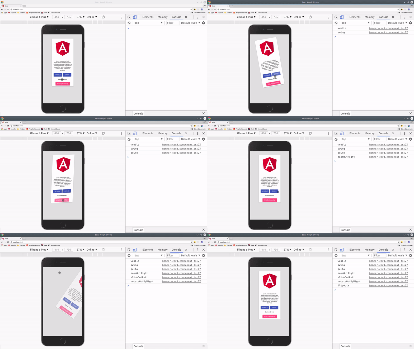
In addition, we will learn how to customize the configuration of HammerJS and build our own custom events beyond the basic ones provided. The end result is six unique animations that run on unique touch events that look like this:
In this lesson, you will learn…
- How to use Animate.css with Angular Animations.
- How to listen to mobile touch gesture events.
- How to customize HammerJS and create custom events.
Initial Setup
The two libraries that make this tutorial possible are HammerJS and Animate.css. Both are extremely popular on Github and widely used in progressive web apps.
First, let’s start with a fresh Angular 5 app and add a couple of resources to it.
ng new awesomeApp
cd awesomeApp

ng g component hammer-card
ng g directive hammertime
Install HammerJS

HammerJS homepage
HammerJS gives us access to mobile gesture events that are not normally found in the browser, including tap, swipe, pan, pinch, press, and rotate. If your audience will be consuming your app on a mobile platform, these events are critical for building a solid user experience.
npm install --save hammerjs
Add the import to main.ts to make the events globally available in your application.
// main.ts

import 'hammerjs';

if (environment.production) {
  enableProdMode();
}

platformBrowserDynamic().bootstrapModule(AppModule)
  .catch(err => console.log(err));
Using Animate.css
Animate.css is a CSS library packed with simple animations that solve many common problems. In this tutorial, we are going to port its animation keyframes to work with Angular’s BrowserAnimationModule. I will show you how to convert CSS keyframes into a format that is reusable in Angular animations. (Note: You do not need Animate CSS installed in your project, we will manually add its styles to our project later).
In the future, Angular is expected to have a CSS parser that will allow us to use CSS keyframes directly, rather than rebuilding them from scratch.
Install Angular Material (optional)
I used Angular Material for this demo, but that part is completely optional. The gestures and animations will work equally well without Material.
Your app module should look something like this
import { BrowserModule } from '@angular/platform-browser';
import { NgModule } from '@angular/core';

import { AppComponent } from './app.component';
import { BrowserAnimationsModule } from '@angular/platform-browser/animations';

import { MatCardModule, MatButtonModule } from '@angular/material';

import { HammerCardComponent } from './hammer-card/hammer-card.component';
import { HammertimeDirective } from './hammertime.directive';


@NgModule({
  declarations: [
    AppComponent,
    HammerCardComponent,
    HammertimeDirective
  ],
  imports: [
    BrowserModule,
    BrowserAnimationsModule,
    MatCardModule,
    MatButtonModule
  ],
  bootstrap: [AppComponent]
})
export class AppModule { }
Hammer Card Component
The component is just a Material Card intended to show you how to compose animations in Angular, then trigger them on HammerJS events.

HammerJS demo with Angular Material Animations
Reusable Animation Keyframes
The one thing I hate about Angular Animations is how much they can clutter up the component TypeScript code. The cleanest way to implement Animate.css with Angular is to define the keyframes in their own dedicated file. The basic process is to copy/paste keyframes from Animate.css to exported constants in Angular. This will allow you to reuse animations throughout your project.
What is a keyframe? A keyframe defines a relative point in time between the start and end of an animation. In Angular, you provide a keyframe with some CSS styles and an offset that defines the point in time (ranging from 0.0 to 1.0). The animation will transition from keyframe to keyframe based on a variable length of time. If you’re brand new to Angular Animation, make sure to watch my animation essentials video.
/* animate.css code */

@keyframes swing {
  20% {
    transform: rotate3d(0, 0, 1, 15deg);
  }

  40% {
    transform: rotate3d(0, 0, 1, -10deg);
  }

  60% {
    transform: rotate3d(0, 0, 1, 5deg);
  }

  80% {
    transform: rotate3d(0, 0, 1, -5deg);
  }

  to {
    transform: rotate3d(0, 0, 1, 0deg);
  }
}
Your job is to make the The Animate.css code above look like the Angular code below (Notice the % is replaced by the offset property).
// keyframes.ts Angular code
import { keyframes, style } from '@angular/animations';

export const swing = [
    style({transform: 'rotate3d(0, 0, 1, 15deg)', offset: .2}),
    style({transform: 'rotate3d(0, 0, 1, -10deg)', offset: .4}),
    style({transform: 'rotate3d(0, 0, 1, 5deg)', offset: .6}),
    style({transform: 'rotate3d(0, 0, 1, -5deg)', offset: .8}),
    style({transform: 'none', offset: 1})
]
For the sake of brevity, I am only including this first animation. Head over to the github project to get all six of the keyframe variables.
hammer-card.component.ts
Now that we have our keyframes in place, we need to setup an animation trigger the defines the transition from one state to the next.
I use the done animation callback to determine when a given animation is complete, then reset the state back to an empty string so we can cycle through various animation states.
import { Component } from '@angular/core';

import { trigger, keyframes, animate, transition } from '@angular/animations';
import * as kf from './keyframes';

@Component({
  selector: 'hammer-card',
  templateUrl: './hammer-card.component.html',
  styleUrls: ['./hammer-card.component.sass'],
  animations: [
    trigger('cardAnimator', [
      transition('* => wobble', animate(1000, keyframes(kf.wobble))),
      transition('* => swing', animate(1000, keyframes(kf.swing))),
      transition('* => jello', animate(1000, keyframes(kf.jello))),
      transition('* => zoomOutRight', animate(1000, keyframes(kf.zoomOutRight))),
      transition('* => slideOutLeft', animate(1000, keyframes(kf.slideOutLeft))),
      transition('* => rotateOutUpRight', animate(1000, keyframes(kf.rotateOutUpRight))),
      transition('* => flipOutY', animate(1000, keyframes(kf.flipOutY))),
    ])
  ]
})
export class HammerCardComponent {

  animationState: string;

  startAnimation(state) {
    console.log(state)
    if (!this.animationState) {
      this.animationState = state;
    }
  }

  resetAnimationState() {
    this.animationState = '';
  }

}
hammer-card.html.ts
The first step is to add the @cardAnimator to the element you want to animate, which is the Material card in this case. When the animation is done, it fires the resetAnimationState() method to set the state back to an empty string.
Now we can simply trigger animations from anywhere in the HTML by listening to events and handling them with the startAnimation(state) method.
<mat-card class="example-card"
          [@cardAnimator]="animationState"
          (@cardAnimator.done)="resetAnimationState()"
          (swipeleft)="startAnimation('slideOutLeft')"
          (swiperight)="startAnimation('zoomOutRight')"
          (swipeup)="startAnimation('rotateOutUpRight')"
          (swipedown)="startAnimation('flipOutY')">

    <mat-card-content>
        <img mat-card-image src="https://angular.io/assets/images/logos/angular/angular.svg">

      <p>
          Learn one way to build applications with Angular and reuse your code and abilities to build apps for any deployment target. For web, mobile web, native mobile and native desktop.
      </p>
    </mat-card-content>
    <mat-card-actions>
      <button mat-raised-button color="primary" (tap)="startAnimation('wobble')">WOBBLE</button>
      <button mat-raised-button color="primary" (tap)="startAnimation('swing')">SWING</button>

      <h5>Custom Events</h5>
      <button hammertime mat-raised-button color="accent" (doubleTap)="startAnimation('jello')">JELLO (doubleTap)</button>
    </mat-card-actions>
  </mat-card>
Customizing HammerJS in Angular
It is very common for developers to customize the behavior of mobile events. For instance, you might want to enable swipeup and swipedown, which are disabled by default.
Custom Configuration for HammerJS
You can access HammerJS in your app module to adjust its configuration options. To enable all swipe events, we override the defaults then tell Angular to use our custom config in the providers array.
import * as Hammer from 'hammerjs';
import { HammerGestureConfig, HAMMER_GESTURE_CONFIG } from '@angular/platform-browser';

export class MyHammerConfig extends HammerGestureConfig  {
  overrides = <any>{
      // override hammerjs default configuration
      'swipe': { direction: Hammer.DIRECTION_ALL  }
  }
}

@NgModule({
  // ...omitted
  providers: [ {
    provide: HAMMER_GESTURE_CONFIG,
    useClass: MyHammerConfig
  }]
})
export class AppModule { }
Creating Custom Events
The purpose of the hammertime directive is to emit custom events. In this case, our custom events are doubleTap and tripleTap. HammerJS will include the tapCount on each event, so we can use this data to build our own custom event. If the count equals 2, then we know the user has double tapped.
import { Directive, HostListener, Output, EventEmitter } from '@angular/core';

@Directive({
  selector: '[hammertime]'
})
export class HammertimeDirective {

  @Output() doubleTap = new EventEmitter();
  @Output() tripleTap = new EventEmitter();

  constructor() { }


  @HostListener('tap',  ['$event'])
  onTap(e) {
    if (e.tapCount === 2) {
      this.doubleTap.emit(e)
    }

    if (e.tapCount === 3) {
      this.tripleTap.emit(e)
    }
  }
}
The End
That’s it for mobile gesture events with HammerJS and Angular Animations. There are many additional possibilities for customization here, but this should give you a decent foundation for composing animations in progressive web apps.
